

 3 weeks ago
43
3 weeks ago
43
PROTECT YOUR DNA WITH QUANTUM TECHNOLOGY
Orgo-Life the new way to the future Advertising by AdpathwayCategories: Community Histories
Tags: map; mapping; West Side
By: Rebekah Coffman
Sep 22 2026
Maps hold the power to shape what we think of a place. In this blog post, Rebekah Coffman, curator of religion and community history at CHM, writes about the Westside Love Map project and how “collaborative cartography” is a way of centering community knowledge in the production of maps as a form of scholar-activism.
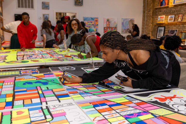
Community mapping event at Muse Coffee Studio, Chicago, 2026. Photograph by Mike McKenzie
What does it look like to put yourself and your community on the map, literally? What does a map designed by neighbors and residents look like? How can a “love map” help heal erasure? These are the questions the Westside Love Map project has been exploring over the last year as a collaboration between West Side preservation group Capstone Clique and the Chicago History Museum.
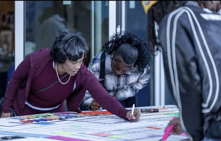
Pastor Reshorna Fitzpatrick (left) and Ayanna Ison (center) annotating the North Lawndale Map at Monday Coffee Co., Chicago, 2025. Photograph by Mike McKenzie
While many of us use maps in our everyday lives, we often take the information they contain for granted and as a source of “truth.” However, like any historical document, maps have an agenda and a bias based on the information they aim to present. When we think about our block or our neighborhood, the boundaries we might draw or the landmarks that stick out may be different than the lines and landmarks on “official” maps. Historically, maps have been created through processes that are, by their very nature, both extractive and abstracted—meaning, they take local, on-the-ground knowledge and disassociate it from living realities and communities. But, there are also powerful and important examples of how communities have countered this erasure and separation.
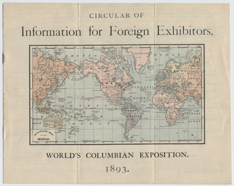
Mercator projector map featured on the cover of Circular of Information for Foreign Exhibitors, World’s Columbian Exposition. 1893. Created by the World’s Columbian Exposition, Office of the Director-General, Department of Foreign Affairs. CHM, ICHi-037997_a
The method for and intent behind making maps can have a large impact on how they appear. An important recent reminder of this is the “Correct the Map” resolution, recently adopted by the United Nations on September 4, 2026, with the goal of creating a more accurate and equitable global map. For centuries, the standard global map was made through a type of projection known as the Mercator projection. Map projections are essentially formulas used to translate the image of a round Earth into a flat image and always result in some imperfections and distortions. Invented in the 16th century by Flemish cartographer Gerardus Mercator, the Mercator version was useful for navigation but distorted the relative size of continents like South America and Africa to appear much smaller than they are in reality. This version of mapmaking has enforced colonial perspectives and had harmful political and economic impacts for countries and continents of the Global South.
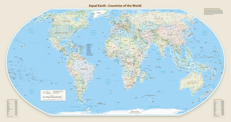
Equal Earth Wall Map. Created by Tom Patterson, 2018. Public Domain, equal-earth.com
Though the distortions and biases within Mercator projections have been known for decades, the change in the global conversation came only recently through the advocacy of Togo and their #correctthemap campaign, backed by the other 54 member states of the African Union. Their resolution proposed using the Equal Earth projection, a mathematical formula created in 2018 that better represents the true relative sizes of countries and continents. For example, Africa, which appeared around the size of Greenland in Mercator projection maps, is in actuality 14 times the size of Greenland. This misrepresentation in size can lead to both conscious and subconscious correlations to power and importance, and correcting this distortion is seen by the United Nations as a move toward repairing historical harms.
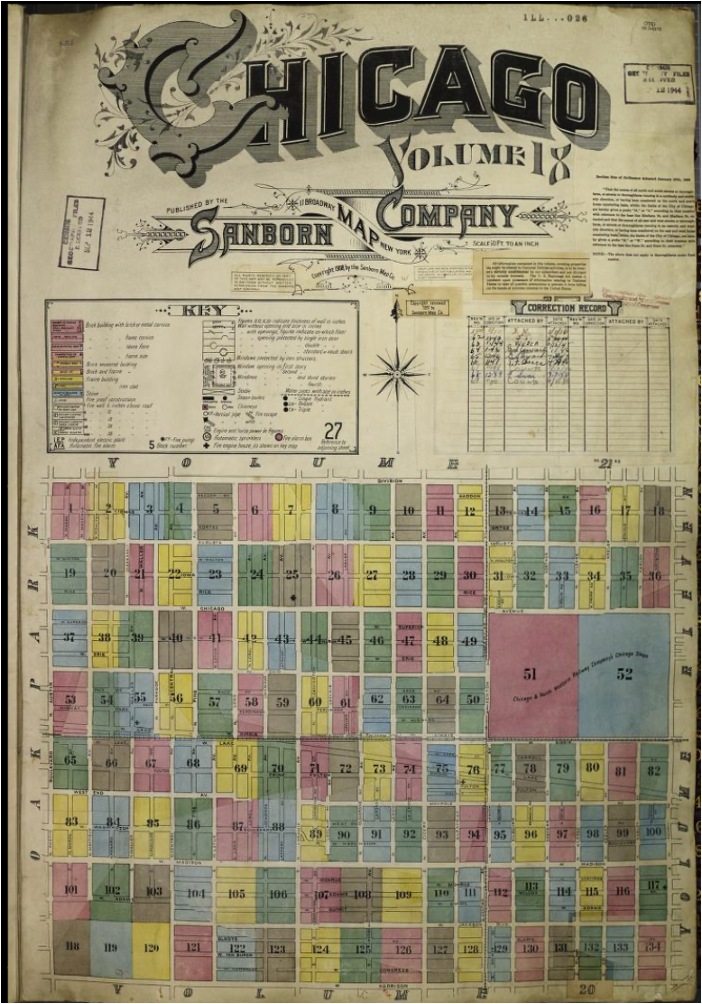
Sanborn Fire Insurance Map for the Austin Neighborhood, Volume 18. Photograph by CHM staff
These issues of power, representation, and the agendas behind cartographic information extend to local area maps as well. In a previous blog post, we looked briefly at how representations of community areas and neighborhoods have been historically manipulated to erase Native presence, racially segregate the city, or create specific political outcomes. Projects like Mapping Inequality, Chicago Covenants, and Folded Map Project bring awareness to the ways in which biases have transformed how land gets divided, space gets used, and place is represented through maps of the city. Many of these maps are the result of top-down zoning and legal policies being inscribed onto existing land and places. They often form a visually sanitized and abstracted view of their impact on the lived experiences of the people and communities whose day-to-day actions shape what happens on the ground.
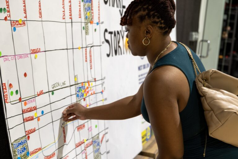
Orri Smith marking places of memory on a map of the Austin community area, 2025. Photograph by Mike McKenzie
A way to counteract the incomplete or biased information seen on maps can be activities known as “countermapping” and “collaborative cartography.” The phrase “countermapping” was first used in 1995 by Nancy Peluso to describe Indigenous land claims in Kalimantan, Borneo, but communities have used similar tactics for centuries to counter dominant colonial narratives through describing and documenting relationships to place through grassroots efforts and lived experiences.
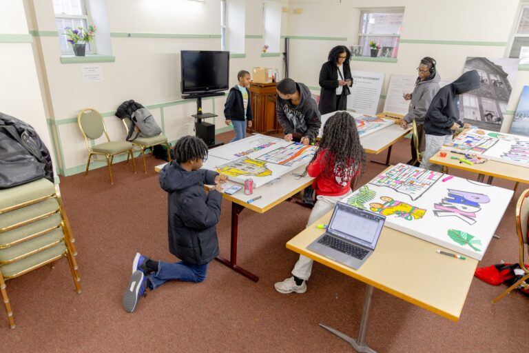
Teenagers annotating the Garfield Park Love Maps at First Church of the Brethren, Chicago, 2026. Photograph by Larry Webb Jr.
“Collaborative cartography” is a way of centering community knowledge in the production of maps as a form of scholar-activism. It aims to include many different voices and ways of knowing, especially from those who have been historically excluded from mapmaking.
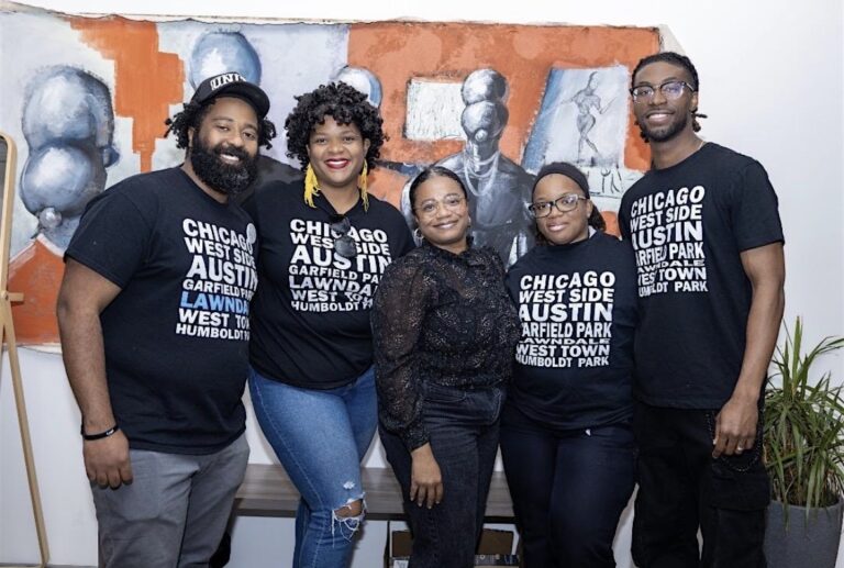
From left: Jay Simon, Drea Slaughter, Erica Griffin-Fabicon, Michelle Williams, and Corey Dooley. Photograph by Mike McKenzie
Our upcoming installation of the Westside Love Map project in collaboration with the Capstone Clique is a powerful example of countermapping and collaborative cartography. Capstone Clique is a Chicago-based storytelling collective dedicated to documenting, preserving, and celebrating the history, culture, and lived experiences of Chicago’s West Side. Formed by Jay Simon, Drea Slaughter, Corey Dooley, Michelle Williams, and Ant Jones, the project began in 2024 when Capstone Clique members served as Community Leadership Fellows.
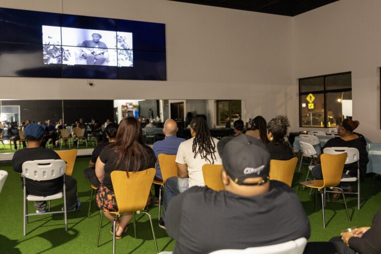
Screening of the film Love Letter to the West Side at Aspire Center in Austin, Chicago, 2025. Photograph by Mike McKenzie
As part of their final fellowship project, they created a documentary film titled Love Letter to the West Side supported by CHM’s Chief Historian and Director of the Studs Terkel Center for Oral History, Dr. Peter T. Alter. Screenings of the film and community discussion were held at CHM’s Robert R. McCormick Theater and at the Aspire Center in the Austin community area.
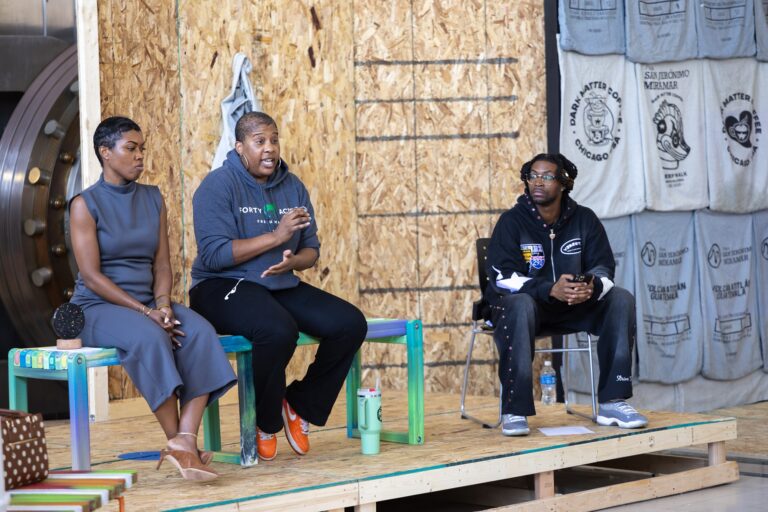
Panel discussion on cooperative economics in Black communities featuring Aisha Oliver and Liz Abunaw of Forty Acres Fresh Market, and moderated by Corey Dooley at alt_space, 2026. Photograph by Larry Webb Jr.
Through 2025 and 2026, Capstone Clique led a series of community workshops and mapping sessions in collaboration with CHM staff including Erica Griffin-Fabicon, Elizabeth E. Cheney Director of Education, and Rebekah Coffman, Curator of Religion and Community History. These included events at Monday Coffee Co. in North Lawndale, First Church of the Brethren in East Garfield Park, alt_space in Austin, and Muse Coffee Studio in the Tri-Taylor neighborhood.
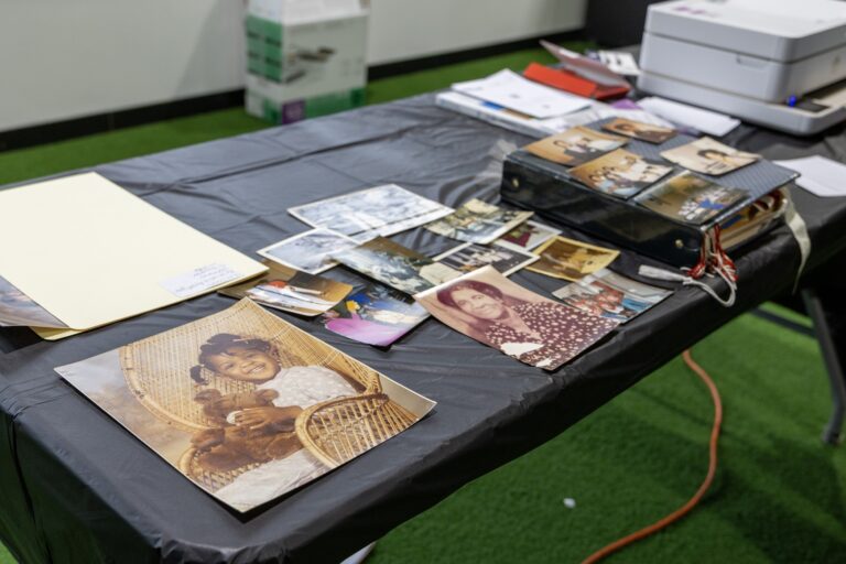
Community-owned archive storytelling and digital archiving station. Photograph by Mike McKenzie
Workshops have focused on a range of preservation, archive, and storytelling activities—from digitizing home archives to collecting oral histories, to sharing music and memories, to West Sider trivia over food and fellowship. The centerpiece of the workshops has been the creation of a series of neighborhood maps drawn on canvases that represent three West Side neighborhoods: Garfield Park, North Lawndale, and Austin. Each map was first outlined and hand drawn by artist Kent Jones and then annotated by West Side community members through color, drawings, memories, a directory of places, and wishes for the future.
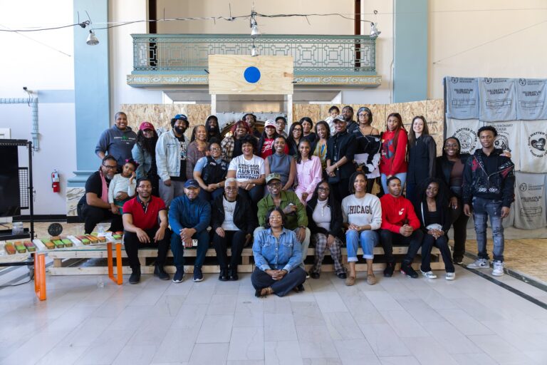
Attendees to the Ujamaa and Color event at alt_space in Austin, 2026. Photograph by Larry Webb Jr.
This collection of canvases and the memories, places, and aspirations they represent demonstrates the power of community taking mapmaking into their own hands. It’s also an important reminder of the ways museums can position power and authority beyond institutional walls. Join us for the opening celebration of the Westside Love Maps exhibition on September 30, 2026, as an opportunity to see the West Side through the eyes of the people who live it, love it, remember it, and continue to shape its future. The maps will be on display through March 2027.
Additional Resources
- Read our blog post “Love Letter to the West Side”
- Read our blog series on the North Lawndale History Project
- Read our blog post “Mapping Chicago and Beyond: What are Chicago’s Neighborhoods, Community Areas, and Wards?”







.png)



.jpg)

 English (US) ·
  French (CA) ·