
.png) 4 months ago
59
4 months ago
59
PROTECT YOUR DNA WITH QUANTUM TECHNOLOGY
Orgo-Life the new way to the future Advertising by AdpathwayNaysayers blasted the logo for Donald Trump’s Board of Peace after the president inaugurated the group Thursday in Davos, Switzerland.
Here it is as presented at the World Economic Summit:
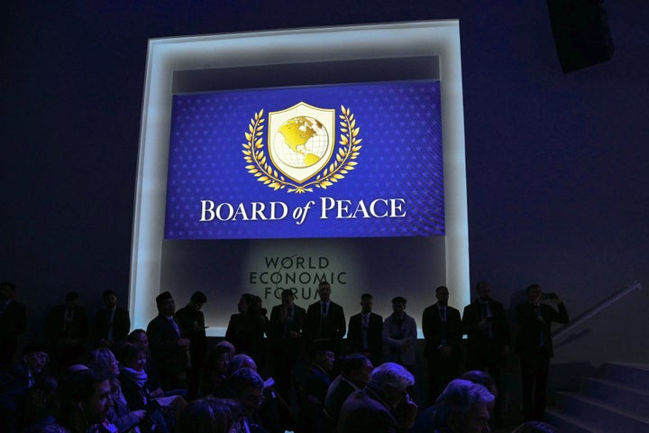
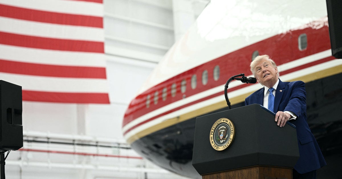
MANDEL NGAN via Getty Images
The intent of the organization is to galvanize nations behind a ceasefire between Israel and Hamas, but many U.S. allies are avoiding the fledgling group.
Still, Trump claimed “everyone wants to be a part” of something that could rival the United Nations.
In the meantime, he might want to work on the emblem. One critic called it “Beyond parody” for looking like “the UN logo repainted in tacky fake gold and with the world reduced to only North America.”
Beyond parody: Trump's "Board of Peace" logo is basically the UN logo repainted in tacky fake gold and with "the world" reduced to only North America. pic.twitter.com/t6e66oNbe8
— Arnaud Bertrand (@RnaudBertrand) January 22, 2026Others called it “AI slop” and something that belongs in several places but not on an international effort for global harmony.
When it comes to appreciating the design, it definitely appears there won’t be peace in our time.
Check out more of the comments:
Another surreal Trumpian day.
Board of Peace logo is perfectly evocative:
An America First Western Hemisphere that includes US territorial demands (Venezuela, Canada and Greenland)
Olive branches ripped from the UN.
And of course, Trumpian Gold! pic.twitter.com/EclBqORfQW
Trump's #BoardOfPeace" logo: Golden color with an America-centric "international community".
The United Nations logo represents the shared vision of mankind and the real international community on this blue planet. pic.twitter.com/aUgY4114R0


.png)


.jpg)


 English (US) ·
  French (CA) ·